New look for my529’s website
Pages are updated for readability and navigation
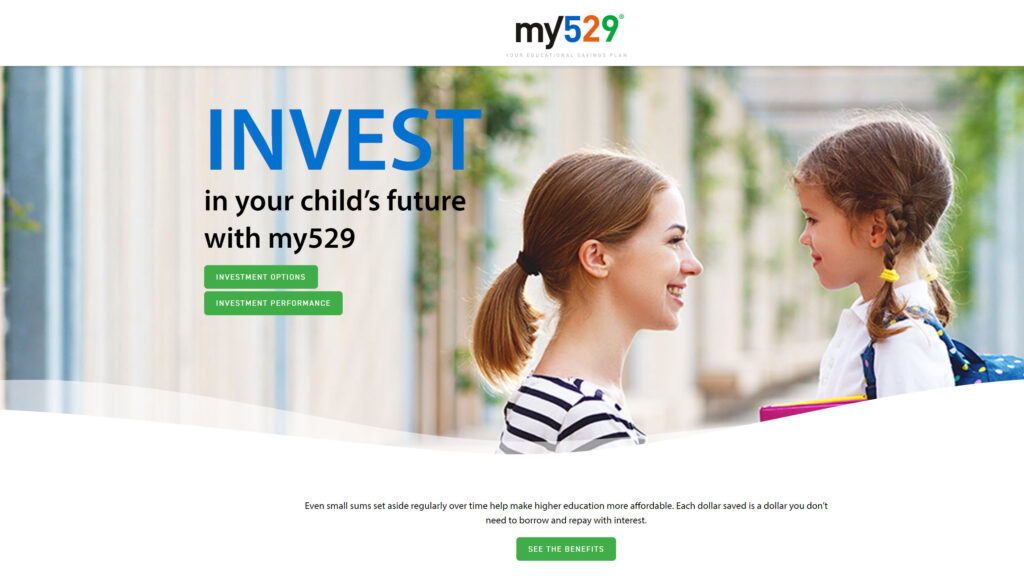
my529 may have the same address, but it now boasts a brand new look. No longer is my529.org the fixer-upper on the side of the information superhighway. The my529 team took the proverbial sledgehammer to the old site and replaced it with a fresh design.
One primary goal of the redesign was to make concepts around saving for college, and, of course, 529s, more relatable to all types of investors. To that end, the redesign set out to simplify the language and to improve the organization of the information our customers seek. We recognize that many financial concepts can be complex and mired in jargon. On the website, as well as in our marketing and disclosure materials, we are trying to do a better job explaining how my529 investment options work and how to manage your account.
Information on the new website is divided into three categories:
- Prospective account owners can learn about the plan under the Benefits of my529 header.
- Current account owners can explore transaction information under the How to Save header.
- Industry or company information is available to everyone under the Learn, Investment Options and FAQ headers.
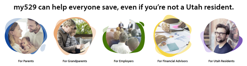
A visitor to the new site will find what they are looking for by using the right-side, fly-out menu and locating the information based on those three categories. Visitors may also navigate the site by selecting one of the five sign posts identified on the my529.org homepage. The five sign posts, or personas, that can help guide a user through the site are: Parents; grandparents; employers; financial advisors; and Utah residents.
No matter where you live, our website is here to guide you to the information you need.
Either avenue, the fly-out menu or the sign posts, will lead you to the exact same information. It will simply be along a more sensible path.
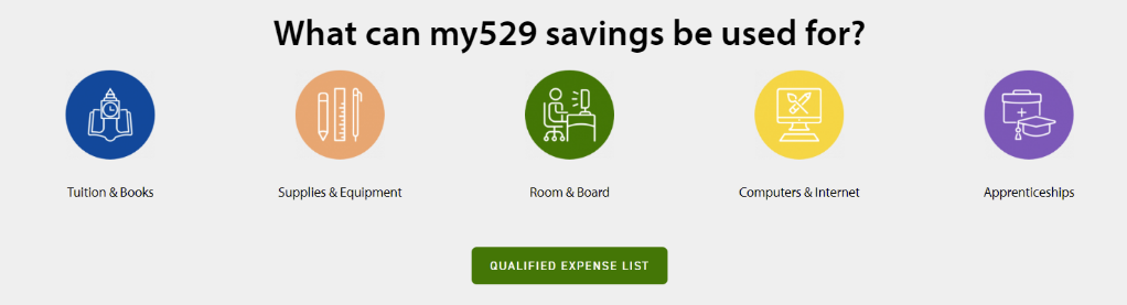
Throughout the website, we also have prompts and pull boxes that allow you to dive deeper into different concepts of a 529 account, such as how you can use the funds in your account.
A combination of more concise language and more use of white space allows for an easier-to-read presentation of the content and for a more relaxed experience navigating through the entire site.
We hope you enjoy the new design, and we welcome your feedback. In the coming months, we will add areas where you can offer your critique of the website and the functionality of the pages.